Update: Before you read further, pretty much every time "Picnik" is used in this blog post, replace it with "PicMonkey". Picnik is (I believe) either completely gone or only available on Google+ now. Also, before I receive any more elitist comments, I KNOW Photoshop is the best photo editing software out there. This post was written with the assumption that most people do not own Photoshop (or Photoshop Elements) and are looking for a super simple, online method of photo editing. It's been a couple years since this post, so I have updated a lot of my equipment and started using Photoshop more, but when I'm short on time, PicMonkey is still where I turn for quick edits and filters.
In the past few years, I would say that my love for photo editing has grown as much as my love for photography itself. In the early days, I used the default photo editor on my computer to subtly enhance photos, moved on to iPhoto when I got my college laptop, and then made the greatest discovery of all: Picnik.com. It's a fantastic website with tons of free and fun photo effects, and I'm proud to call myself a Picnik junkie. However, I think there's a fine line between the USE and ABUSE of Picnik. Which will be the main topic of my blog post today.
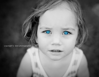
I think wacky photo effects and edits can be extremely fun if used the right way. I like photos with a natural look, but I don't think there's anything wrong with a little experimentation with color from time to time. An editing technique that is one of my personal favorites is selective coloring (black and white with certain features kept in color), which can be done relatively easily on Picnik. The Lomoish, Holgaish, Gritty, Fancy Focus and other effects on Picnik can also make for an interesting photo.
To illustrate an example of tasteful Picniking, I chose this photo of a little girl from Google Images (I would have chosen my own photo, but this one helps make my point better). I took the original photo into Picnik, made the photo black and white, and used selective coloring to make her blue eyes pop. The original photographer had obviously done some editing of his own, so no further editing was necessary. This, to me, is a good example of how Picnik can add even more visual interest to an already intriguing photo.

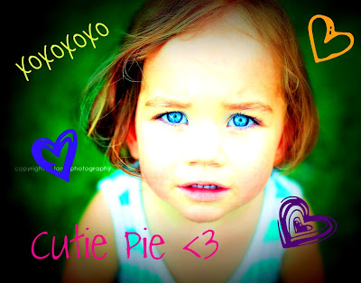
Now, here is the same photo, edited in a way that makes my skin crawl. I call this the "Facebook edit" because this is what every teenage girl does to mutilate her profile picture before she posts it. All I did was apply the Lomo effect (on full blast without any fading) and add a bunch of cutesy text and stickers. This is the hallmark of the "Facebook effect": oversaturation of color and cheesy text and clipart. What I did to this photo is actually extremely tame compared to what I've seen others do. Most of the time, it's a very poorly taken photograph, with lines upon lines of bad poetry or misspelled song lyrics plastered all over it, and a bunch of smiling people saturated to a lovely day-glow orange hue. Even worse, is when someone stamps dorky poetry all over a beautifully taken sunset photo. It's an abomination, it really is... Really, people, I don't need you to tell me that you're "Best friennddzzz <<<<3", I can figure that out by that fact that you're smiling and have your arms around each other in the picture.

Don't get me wrong, I don't think that text has no place in photo editing. I actually think it can be extremely useful if used in the correct situation. My mother is actually thinking about using Picnik to make my brother's graduation reception invitations due to the fact that there are so many fonts and effects available (not to mention the money-saving aspect of the idea). Text and other wacky edits can make for an awesome photo if used in the right way and used sparingly. I just wouldn't advise adding words or tie dye colors to every photo you take. Sometimes natural is the way to go.
Below are some Picnik edits of my own. Some are more subtle, while others are are little out there. However, I don't think any of my edits are too over the top and make good examples of some of the entertaining effects available on Picnik and other photo editing programs.
 |
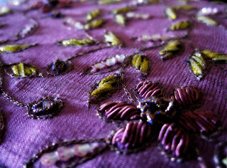
| As you can probably tell, this is my blog background. All I did to this was punch up the color by using the "Ortonish" effect and then used the fade bar to make the effect less intense. |
 |
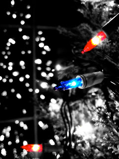
| This one is a little crazier. I used a combination of B&W, selective coloring, and Lomo effects for this. |
 |
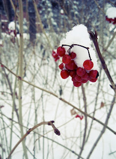
| This one doesn't even look Picniked at all. It actually has much less of a yellow tone than before because I used the Winterize effect to dull the color slightly. |
 |
| Here is an example of what I think is a good use of text. I took the original photo and punched up the color with Lomo and added text to turn it into an interesting desktop background for my laptop. I still like the original, but I wanted something with a little more pizzazz as my computer background. |
The Bottom Line: Be careful how you Picnik. Have fun with your photos, but don't saturate them to the point that the colors are blinding or add juvenile text to every photo. Sometimes a quick slide of the "fade" bar can take a Picnik effect from tacky to terrific by lessening its impact. When in doubt, just do a little maintenance editing (sharpen, contrast, etc.) and leave it alone!


